The original cover is bold and daring, but its black & white palette and dark lighting make it less visually striking by today’s standards. That’s why I was tasked with creating an alternative interpretation, one that preserves the essence of the message of the album while making a stronger visual impact.
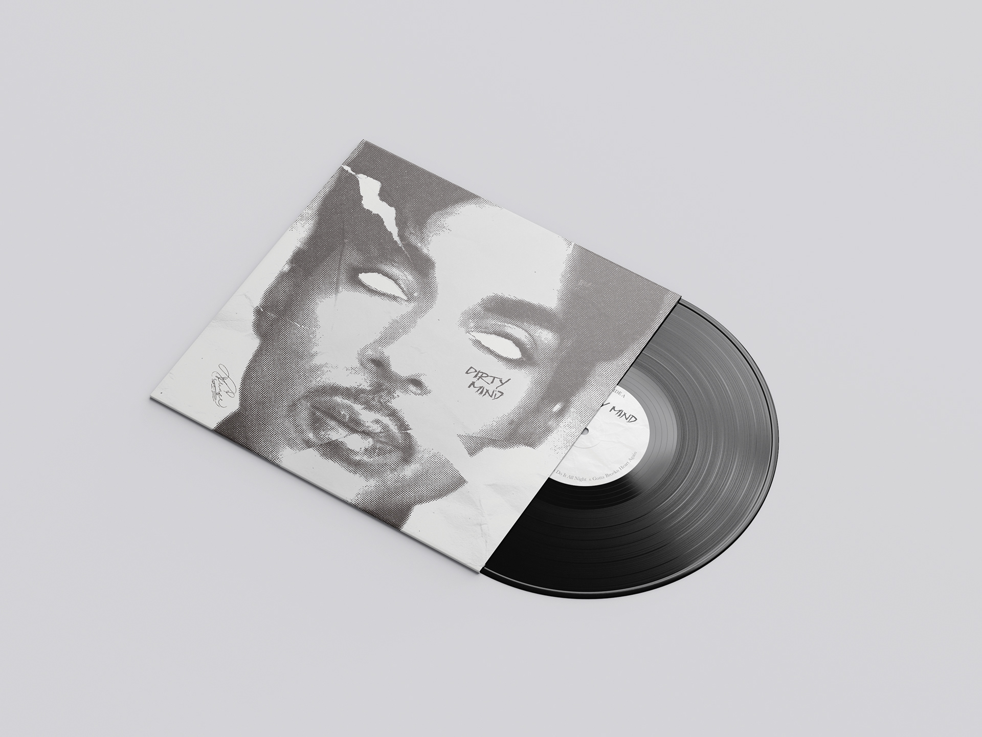
In my version, Prince is portrayed in an emotionless, almost soulless form, with his eyes cut out. This symbolises transparency, inviting the viewer to see through the facade and glimpse his true self. It’s a visual metaphor for vulnerability and openness, especially in relation to his sexuality, something deeply personal and often controversial at the time.
The torn paper represents society's criticism and discomfort with sexual freedom during that era. Yet despite the damage, Prince remains untouched, his identity and confidence unshaken. This element reinforces his resilience and defiance against societal norms.
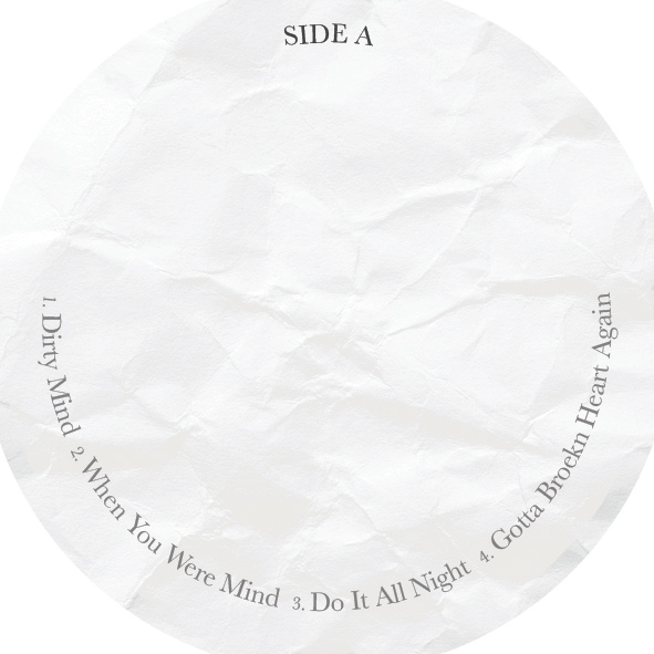
To pay homage to the original cover, I incorporated a soft black and beige tone. This choice is an ode to the monochromatic feel of the original, but through a modern, minimalist lens.
The process behind the cover was intentionally hands-on to achieve a raw, authentic feel. I began by digitally manipulating the image in Photoshop to add the initial effects and establish the desired mood. Once satisfied with the composition, I printed the image out and physically altered it by ripping and wrinkling the paper by hand. This tactile step introduced genuine texture and imperfections that couldn’t be replicated digitally, and loads of fun during the design process!
I then scanned the altered piece back into the computer, preserving the physical distortions while reintroducing it into a digital format. This blend of digital and physical media enhances the emotional depth and gives the final cover a more lived-in quality, underscoring the themes of exposure, criticism, and resilience present in the concept.
This was developed as part of a study project.


Adobe Photoshop, Analog Design